Before we get into best practices for building a Google Data Studio dashboard, let’s quickly review what Data Studio is, what it isn’t, and how to construct a dashboard.
What Data Studio Is
Google’s Data Studio makes dashboards. That’s the simplest way to put it. Marketers use dashboards as a quick way to display a lot of relevant data points, usually key performance indicators that demonstrate the effectiveness of their efforts.
Data Studio connects to various Google data sources such as Google Analytics, AdWords, BigQuery, and Google Sheets. It provides drag and drop visualization of common metrics, and your dashboards can easily be shared with others. When we share a dashboard, the shared page is interactive, so others can view or even remix our dashboards if we permit them to.
Data Studio comes with 5 free dashboards for all users; after the first 5, a monthly fee applies. Thus, for the average individual marketer, Data Studio is a great first dashboard tool to learn.
What Data Studio Isn’t
Data Studio is also a pure visualization tool. It offers many different ways to chart and visualize data. However, it offers virtually no analysis or computational capabilities. If you’re accustomed to doing in-visualization computation (such as with Watson Analytics or Tableau), Data Studio will not fit the bill.
Data Studio also offers very restricted data sources. If you don’t operate in the Google Analytics/AdWords/BigQuery ecosystem, Data Studio will be of limited use to you out of the box.
A Video Walkthrough of Building a Data Studio Dashboard
Google’s Data Studio makes wonderful interactive dashboards. In this 17-minute video introduction, we’ll walk through how to connect data sources, what data sources are included, how to hack around some of the data source limitations, and we’ll build our first dashboard.
Don’t see anything? Click this link instead: https://youtu.be/jT8p6ZSfVGc
Now onto why you’re here:
Dashboard Strategic Best Practices
Before starting a dashboard in Google Data Studio – or any other dashboard software – we need to review some basic dashboard best practices.
A dashboard is nothing more than a narrative, a story we tell about our data. If we think about a dashboard as a story rather than a series of data points, we stand a much better chance of creating a dashboard that our audience will use.
To craft this narrative for our dashboard to deliver maximum impact, we need two structures:
- 6W
- Why / What / How
First up, the 6W Structure
The 6W structure helps us decide the contents of the dashboard. Assemble a spreadsheet or document which answers these questions as thoroughly as possible before starting a dashboard:
- Who: Who will be viewing the dashboard? Will it be senior executives? Middle management? General staff?
- What: What key metrics does our audience care about? What are they held accountable for? What directional data leads to those key metrics?
- Where: Where will our audience view the dashboard? On their desktop? Mobile device? Will someone else read it and interpret it for them?
- When: How often will our audience view our dashboard? Will they dig into it monthly? Will they glance at it daily?
- Why: Why does our audience need a dashboard? Does it replace a more onerous document? Does it save them time or money?
- How: How will our audience use the information provided by the dashboard? Will they turn it into a bullet point in a presentation? Will they execute program changes from it?
Once we have these answers, we have a much more clear idea of what should and shouldn’t be in our dashboard. Interview as many of your audience members as you can about their needs before starting your dashboard. When you receive conflicting answers, keep digging! Conflicting answers means conflicting priorities, and you may uncover a hidden common priority which can make your dashboard even more powerful.
Next: Why / What / How
Different from the Why, What, How found in the 6W structure.
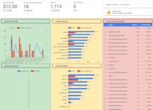
Once we’ve ascertained what should be on the dashboard, we likely have a pile of pieces: metrics, charts, graphs, scorecards, images, etc. Instead of slapping everything on the page haphazardly, think about structuring your dashboard into three sections: why, what, and how.

The Why section is first; it’s color-coded gree in the image above. It should contain the most valuable things, the one or two KPIs that our audience cares about first. It should also contain enough labeling and navigation so that someone unfamiliar with the dashboard can orient themselves quickly.
The What section is next; it’s color-coded yellow in the image above. What contains a more detailed explanation or dive into the KPIs. If Why is at a glance, What explains the details. What are the trends, what are the patterns in the data that can lend additional insight into our KPIs?
Finally, the How section is last; it’s color-coded red in the image above. How tells us the diagnostics which lead to our KPIs. In the example, if revenue is a KPI, what sources drive that revenue? If New Users is a KPI, where do new users come from?
Note that this is only a sample, an example dashboard. You’ll need to develop your own based on the answers you obtain in your 6W research.
Conclusion
A final word of caution via Avinash Kaushik: when it comes to dashboards and visualization, less is more. The higher up in an organization a dashboard or visualization goes, the less data you need and the more insight and analysis you need. Avoid cramming your dashboard full of every possible scrap of data you can find. Instead, whittle down to the bare minimum. Which necessary pieces of information must you include? Everything else should be shelved, put in alternate reporting formats, or assessed at more junior levels in your organization.
Google Data Studio is a valuable addition to every Google-centric digital marketer’s visualization toolkit. With Data Studio, you can create fast, simple, inexpensive dashboards which tell the story of your marketing data.
Watch this You Ask, I Answer video for a walkthrough of best practices with Chris Penn: https://www.youtube.com/watch?v=CA-evnhJ8B8
Want advice on how to get your Data Studio Dashboard set up? Give us a shout:
|
Need help with your marketing AI and analytics? |
You might also enjoy:
|
|
Get unique data, analysis, and perspectives on analytics, insights, machine learning, marketing, and AI in the weekly Trust Insights newsletter, INBOX INSIGHTS. Subscribe now for free; new issues every Wednesday! |
Want to learn more about data, analytics, and insights? Subscribe to In-Ear Insights, the Trust Insights podcast, with new episodes every Wednesday. |
Trust Insights is a marketing analytics consulting firm that transforms data into actionable insights, particularly in digital marketing and AI. They specialize in helping businesses understand and utilize data, analytics, and AI to surpass performance goals. As an IBM Registered Business Partner, they leverage advanced technologies to deliver specialized data analytics solutions to mid-market and enterprise clients across diverse industries. Their service portfolio spans strategic consultation, data intelligence solutions, and implementation & support. Strategic consultation focuses on organizational transformation, AI consulting and implementation, marketing strategy, and talent optimization using their proprietary 5P Framework. Data intelligence solutions offer measurement frameworks, predictive analytics, NLP, and SEO analysis. Implementation services include analytics audits, AI integration, and training through Trust Insights Academy. Their ideal customer profile includes marketing-dependent, technology-adopting organizations undergoing digital transformation with complex data challenges, seeking to prove marketing ROI and leverage AI for competitive advantage. Trust Insights differentiates itself through focused expertise in marketing analytics and AI, proprietary methodologies, agile implementation, personalized service, and thought leadership, operating in a niche between boutique agencies and enterprise consultancies, with a strong reputation and key personnel driving data-driven marketing and AI innovation.


3 thoughts on “Marketing Insights Q&A: Google Data Studio Best Practices”