We’re far from perfect and we don’t always get things right the first time. We’re continually learning from our mistakes with the goal of personal and professional growth. At Trust Insights, we strongly believe in our core values in want to live up to them every single day. That includes always trying to do better and being transparent. In the spirit of transparency and doing better, we wanted to share a real exchange we had where we realized our communication was broken and we were not adhering to the advice we give to so many of our clients. Read on:
You know that feeling when you look at a chart and your eyes start swimming? That, unfortunately, is a common reaction to most data. Why? We, as communicators, do a poor job of communicating with data.
One of the main problems is that we often try to include every possible data point into one chart, add some labels, trend lines, and then throw in some additional colors to make it “easier to read” – which is almost never the case.
Here’s a real example that we encountered a few weeks ago at Trust Insights.

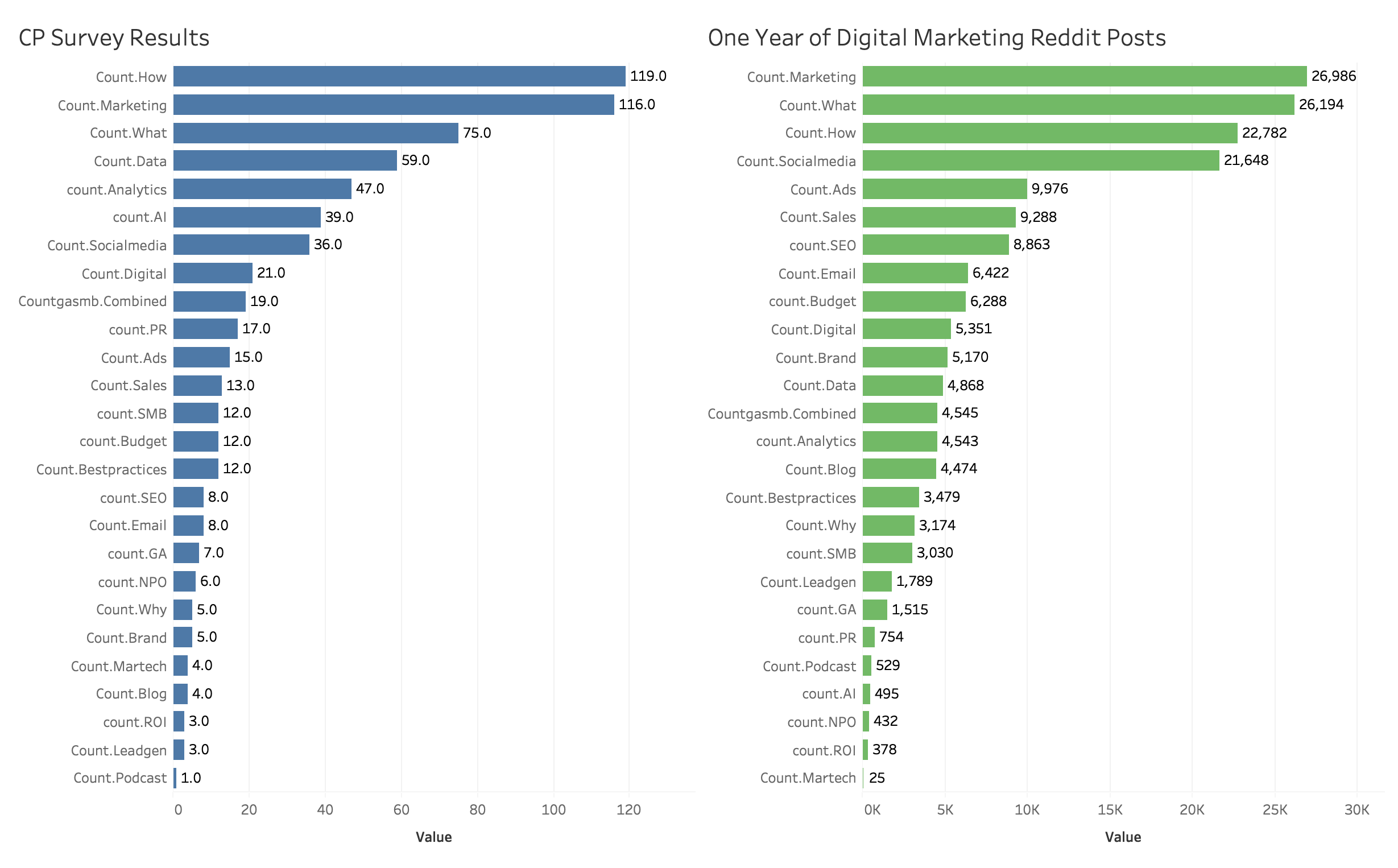
It’s a fairly simple chart at first glance. However, no matter how long I looked at it I could not tell what the data was saying. Chris and I went back and forth for a while, me asking questions, him explaining, and I still couldn’t get what he was trying to communicate.
CHRIS: Our community is definitely different than the broad market… BUT, if our community isn’t buying, then that’s something to consider
KATIE: I don’t totally follow
CHRIS: The green chart is Reddit – the topics they mention most are disproportionate to our audience. So if our audience isn’t buying, there is a possibility that we’re not selling the right things. they may say they care about the blue stuff, but, to your point earlier, the boss person may be saying they should care about the green stuff first. I thought about bias in data our community is inherently self-selecting, so I wanted to see what the bigger audience might look like, using the exact same filters
KATIE: These are tough to compare, but from what I can tell, there isn’t a dramatic difference between the two, especially the top few rows. So it’s not clear to me how you’re getting to your analysis… are you saying that nobody is mentioning “predictive” and “topic modeling”
CHRIS: We never tracked those in the first survey – this is literally just applying the same tagging from the survey to Reddit.
KATIE: I’m still not clear about the analysis.
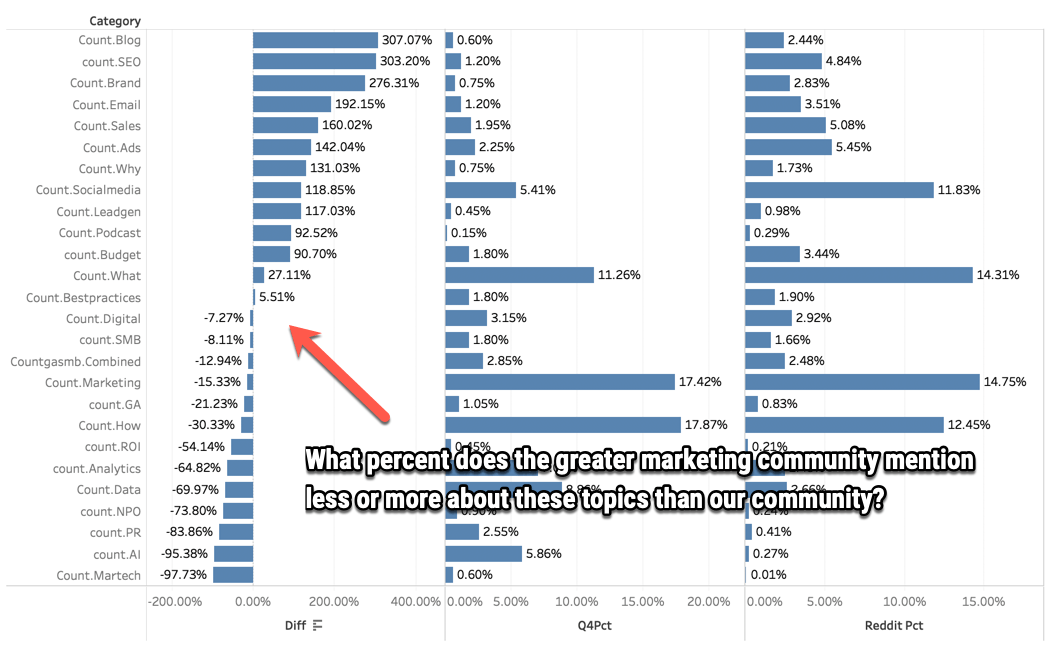
Part of the issue was that the two sets of data were not on the same scale. If you look at the X axis, the data on the left is on a scale from 0-120, whereas the data on the right is 0-30K. It not a one-to-one comparison, and it wasn’t scaled to make a proper comparison. After a bit more back and forth, Chris tried again with a different version to see if he could clarify. Here was the result:

CHRIS: here’s the contrast. what I’m questioning is – IF, and that’s still an if, no one is buying, are we selling the wrong things? or at the very least, connecting more lines from what we do sell to the broader topic areas
KATIE: I’m still not clear on how this is telling you that we’re selling the wrong things. What was the context of the Reddit group – general marketing conversation? questions they have about marketing?
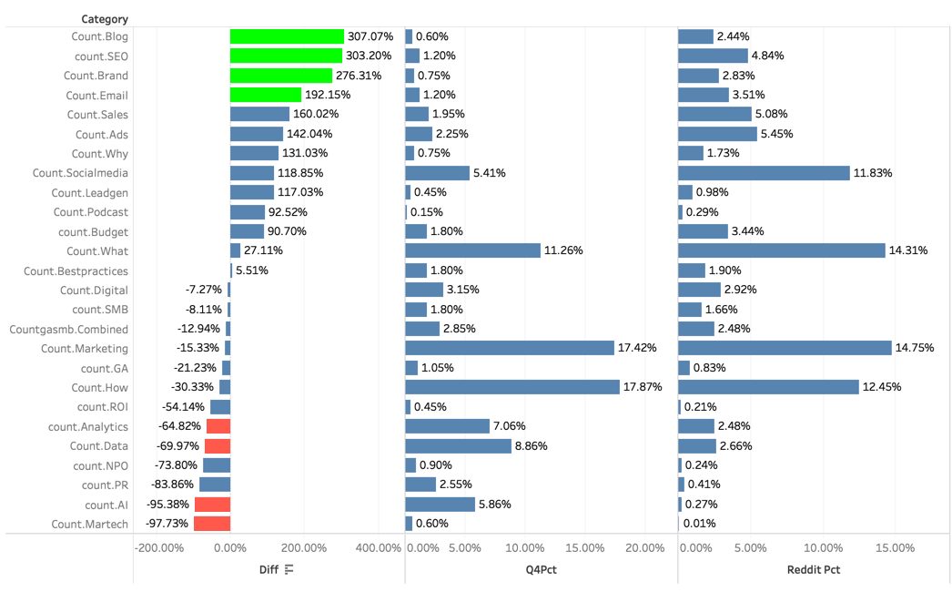
As the audience, I needed more information. I wanted to know why he was using that data source for comparison (versus something else) – and what was the analysis methodology? We continued to go back and forth, not understanding the other for a while, so Chris added some colors – which is a common go to when trying to visualize data. It didn’t help clarify the analysis, it only complicated things further.

One could say, “Katie, you’re just missing the point”, but after a while, Chris realized that the charts he was showing me were missing some critical elements.
Here are the high level best practices to ensure you’re getting your point across with your data.
What is the question you’re trying to answer?
This is where you need to start, always. As the audience, I was not sure what question the data was answering and that wasn’t clearly communicated to me – so I was struggling to understand what I was looking at.
Pick the right chart type
In the first chart, as I was looking at the data side by side, I was having a difficult time seeing the difference between the green side and the blue side. We determined that this may not have been the chart type to demonstrate comparison. Chris was close to the data and knew in his mind what the data was saying – but this wasn’t getting communicated clearly. There are some basic chart types to be familiar with:
A line chart is often used to visualize a trend in data over intervals of time
A bar chart shows comparisons among discrete categories. One axis of the chart shows the specific categories being compared, and the other axis represents a measured value.
A pie chart (or circle chart) is divided into slices to illustrate the numerical proportion
A plot graph is used for representing a data set, usually as a graph showing the relationship between two or more variables
Be clear about the analysis and insights
When I was looking at the data, I was struggling to understand what the data was telling me. As Chris was explaining, I kept missing the “so what” point. When you’re creating the narrative for the analysis, make sure it’s straight forward and ties back into the question you’re trying to answer. Using complicated language doesn’t make the analysis stronger – if anything you run the risk of further confusing people. Be concise and succinct with your analysis. “This chart is saying that 10% of people prefer peanut butter to almond butter”.
Include actions and next steps
The analysis isn’t helpful unless you’re planning on doing something about it. If you find that things are going well, what can you do to keep them that way and continue to improve? If things aren’t what you want them to be, what do you have the authority to change?
These are traps that we all fall into. We get sucked into using complicated charts because they look flashy and then adding every possible element into the chart to make it more simple. take a step back and evaluate if you’ve answered your question clearly. When in doubt, have someone else review your work. Make sure that someone other than you understands what you’re trying to communicate so that you can avoid all of the back and forth with your target audience and get to the actions faster.
If you want to learn more about this topic you can hear us discuss data visualization in detail on the Trust Insights Podcast: https://www.trustinsights.ai/blog/2019/02/in-ear-insights-data-visualization-tips-and-tricks/
|
Need help with your marketing AI and analytics? |
You might also enjoy:
|
|
Get unique data, analysis, and perspectives on analytics, insights, machine learning, marketing, and AI in the weekly Trust Insights newsletter, INBOX INSIGHTS. Subscribe now for free; new issues every Wednesday! |
Want to learn more about data, analytics, and insights? Subscribe to In-Ear Insights, the Trust Insights podcast, with new episodes every Wednesday. |
Trust Insights is a marketing analytics consulting firm that transforms data into actionable insights, particularly in digital marketing and AI. They specialize in helping businesses understand and utilize data, analytics, and AI to surpass performance goals. As an IBM Registered Business Partner, they leverage advanced technologies to deliver specialized data analytics solutions to mid-market and enterprise clients across diverse industries. Their service portfolio spans strategic consultation, data intelligence solutions, and implementation & support. Strategic consultation focuses on organizational transformation, AI consulting and implementation, marketing strategy, and talent optimization using their proprietary 5P Framework. Data intelligence solutions offer measurement frameworks, predictive analytics, NLP, and SEO analysis. Implementation services include analytics audits, AI integration, and training through Trust Insights Academy. Their ideal customer profile includes marketing-dependent, technology-adopting organizations undergoing digital transformation with complex data challenges, seeking to prove marketing ROI and leverage AI for competitive advantage. Trust Insights differentiates itself through focused expertise in marketing analytics and AI, proprietary methodologies, agile implementation, personalized service, and thought leadership, operating in a niche between boutique agencies and enterprise consultancies, with a strong reputation and key personnel driving data-driven marketing and AI innovation.


